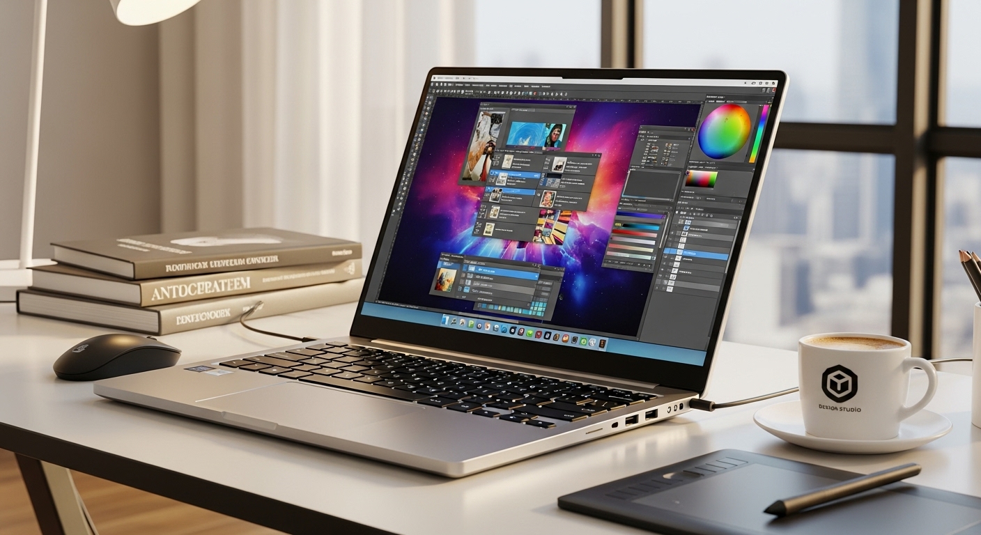
sRGB vs DCI-P3, brightness targets, and ICC profiles—without the confusion
If you do design work on a laptop, calibration is the difference between “looks good on my screen” and “looks good everywhere.” The goal isn’t perfect lab accuracy—it’s consistent, predictable color so what you deliver matches what clients (and printers) see.
1) First: Know Your Color Target (sRGB vs DCI-P3)
sRGB (the safest default)
Use sRGB if you:
- design for websites, apps, social media, YouTube thumbnails, UI/UX
- want colors to look “normal” on most phones/laptops/monitors
Why: Most consumer displays and web content are still closest to sRGB behavior.
DCI-P3 (wider, punchier colors)
Use DCI-P3 if you:
- do video work, marketing visuals, modern device-focused content
- work on Apple devices or wide-gamut workflows often
Watch out: If you edit in P3 but export without proper settings, colors can look over-saturated on non-wide-gamut screens.
Quick decision
- UI/web/brand graphics: start with sRGB
- Video + wide-gamut content: consider DCI-P3, but only if you understand your export pipeline
2) The Two Easy Wins Before “Real” Calibration
You can improve accuracy immediately without tools.
A) Turn off “fake color” features
Disable anything that dynamically changes color:
- Night light / blue light filter
- “Vivid” / “Dynamic” / “Enhance colors”
- Adaptive brightness / auto contrast
- HDR (for design work, keep HDR off unless you specifically grade HDR)
B) Pick a consistent viewing environment
Color changes with lighting. Best practice:
- Avoid direct sunlight on the screen
- Use steady room lighting (not changing day/night lighting)
- Try not to work right next to a very warm/yellow lamp
3) Brightness Targets (simple numbers that work)
Brightness (luminance) is where beginners mess up most—too bright makes designs look “better” than they really are, and you end up exporting dark work.
Recommended brightness targets
- 100–120 nits: best for print-focused workflows in a controlled room
- 120–160 nits: great general target for design in normal indoor lighting
- 160–200 nits: only if your room is bright and you can’t control lighting
Beginner rule of thumb (no meter)
- Set brightness so white looks white, not glowing
- If you often design at night, lower brightness to avoid over-dark exports
4) Gamma and White Point (don’t overthink it)
These are the “calibration defaults” used in most workflows.
Gamma
- Use Gamma 2.2 (standard for web and most design workflows)
White point (color temperature)
- Use D65 / 6500K (standard daylight) for general design/web
- If you do print and your studio lighting is warm, you might prefer D50 / 5000K, but that’s more advanced and situational
Beginner recommendation: Gamma 2.2 and white point D65.
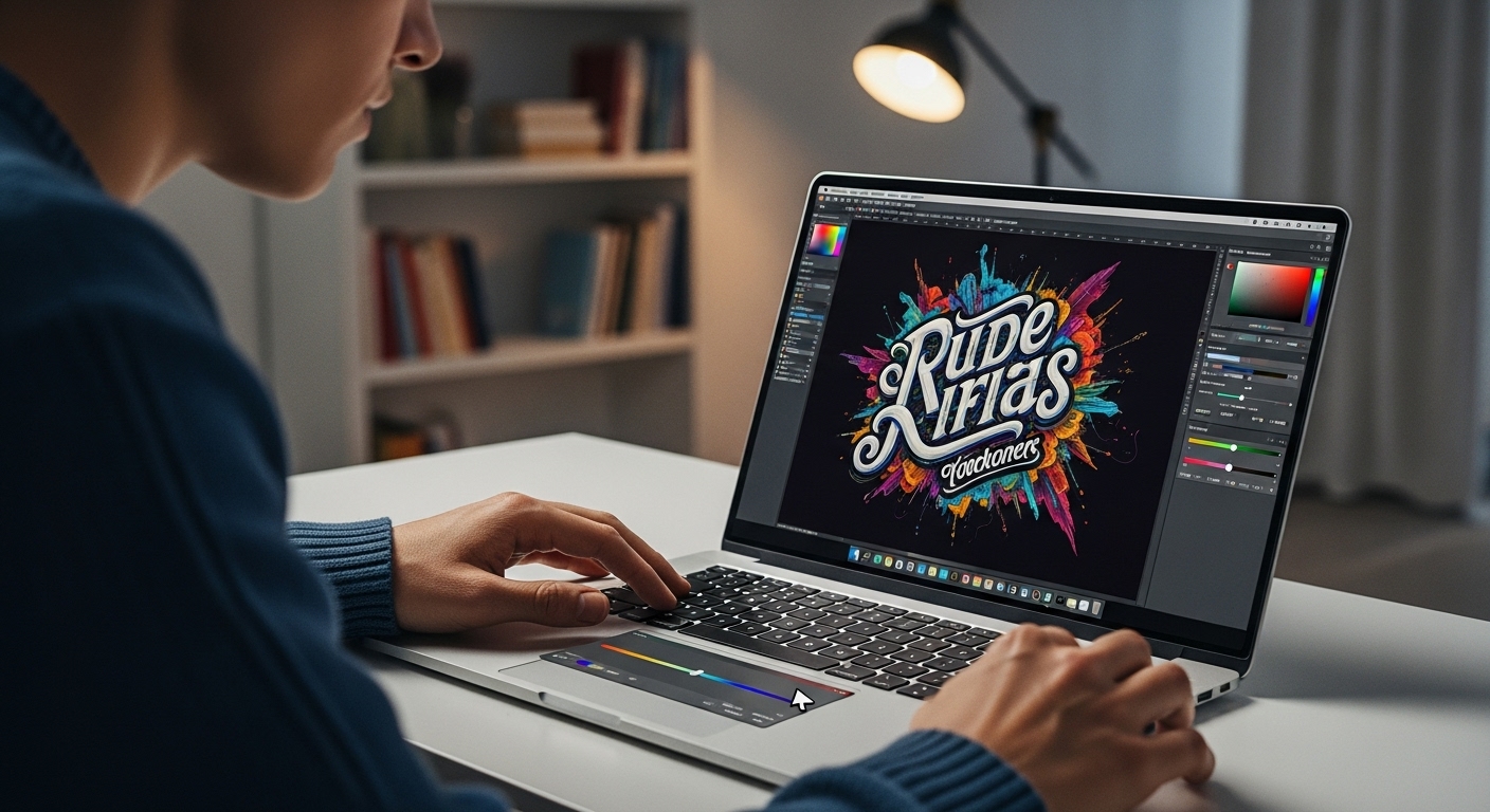
5) What an ICC Profile Is (and what it isn’t)
An ICC profile is like a “translation guide” that tells your computer how your display actually shows color. Apps that are color-managed (Photoshop, Lightroom, many browsers) use it to display accurate colors.
Important notes
- ICC profiles help color-managed apps most.
- They don’t magically make a bad panel good (e.g., poor coverage, uneven backlight).
- Using the wrong ICC profile can make colors worse.
6) Two Ways to Calibrate: Easy vs Best
Option A: “Good Enough” calibration (no hardware)
This won’t be perfect, but it’s a big improvement.
Step-by-step
- Set resolution to native and refresh rate to default/high
- Disable Night light / True Tone / HDR / Vivid modes
- Set brightness using the target above (aim 120–160 nits feel)
- Set your display mode to sRGB if your laptop has that toggle
- Use the built-in calibration tool:
- Windows: “Calibrate display color” (search in Start menu)
- macOS: System Settings → Displays → Color → Calibrate (or Display Calibrator Assistant)
What this improves
- Fixes obvious issues like crushed blacks, gray whites, harsh gamma
- Gives more consistent results across apps
What it can’t do well
- True color accuracy across the full range (needs a measurement device)
Option B: Best calibration (with a colorimeter)
If design work is paid work or brand-critical, this is worth it.
What you need
A small device like a colorimeter (used by designers) that measures the screen and builds an ICC profile.
Step-by-step (beginner-friendly)
- Warm up your screen 15–20 minutes
- Disable HDR/night filters/vivid modes
- In calibration software choose:
- Color space: sRGB (or P3 if you truly need it)
- White point: D65
- Gamma: 2.2
- Brightness: 120–160 nits (pick one and stick to it)
- Run the calibration and save the ICC profile
- Set the new ICC profile as default
Why it’s better
- It measures your panel (not a generic factory profile)
- Fixes color bias and gray balance much more accurately
7) How to Use sRGB / P3 Correctly in Real Projects
This is where people accidentally oversaturate work.
If you design for web/social/UI
- Work in sRGB
- Export in sRGB
- Check your output in a normal browser and on a phone
If you work in wide gamut (P3)
- Make sure your app and export settings are correct
- Convert to sRGB when delivering for web unless you’re sure the platform supports wide gamut properly
Beginner advice: stick to sRGB unless you have a clear reason to use P3.
8) Quick Accuracy Checks (simple and practical)
After calibration, do these sanity checks:
- A neutral gray should look neutral, not green/pink
- Skin tones should look natural (not too orange or too magenta)
- Black shouldn’t crush details (you should still see near-black texture)
- White shouldn’t blow out highlights
If any of these look wrong, your brightness or profile may be off.
9) Common Mistakes (and how to avoid them)
- Too bright screen → exports too dark
→ lower brightness to ~120–160 nits feel - Editing in P3 → exporting for web without conversion
→ use sRGB for web deliverables - Night light enabled
→ disable during design sessions - Using random ICC profiles from the internet
→ only use profiles made for your panel (or factory profile if reputable)
Recommended “Beginner Default” Setup (copy/paste)
If you want one safe setup that works for most designers:
- Color space: sRGB
- White point: D65 (6500K)
- Gamma: 2.2
- Brightness: 120–160 nits (pick a consistent level)
- HDR/night light/vivid modes: Off
- Use an ICC profile: preferably measured with a colorimeter; otherwise factory + OS calibration